This blog post will show my research into colour theory and psychology
Mise-en-scene is a crucial element of a production. In order to be able to better incorporate mise-en-scene into our music video, I have decided to research colour as it can be used as a tool to incorporate meaning into mise-en-scene.
Definitions
Hue: Pure colour
Shade: A hue added with black to create a darker colour
Tint: A hue added with white to creare a lighter colour
Value: How dark/light a colour is. Basically, how much shade/tint a colour has.
Saturation: The vibrancy of a colour
Colour meaning
Colour can be seperated into 2 main categories:
- Warm colours: Colours that are commonly associated with the feeling of warmth such as red, orange and yellow. Using a warmer colour pallete can evoke a sense of comfort and safety.
- Cool colours: Colours that are commonly associated with the feeling of coolness such as blue, purple and green. Using a cooler colour pallete can evoke a sense of isolation and sadness.
Certain colour can also evoke certain feelings outside of just the connotation of their types which can be used to distribute meaning in a media text. The feeling evoked can be determined by considering what the colour is most commonly associated with in real life. For example, green is often associated with nature and therefore can be used to create a natural feeling whereas red is often associated with blood and therefore can be associated with danger
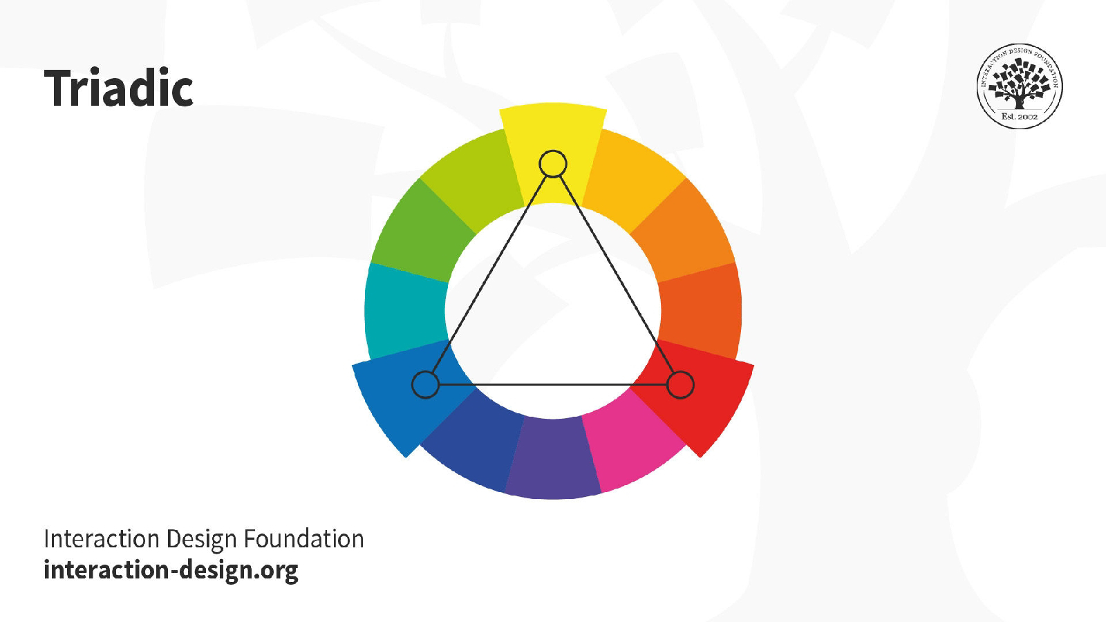
Colour palettes
Colours can be comnined to achieve colour harmony. Here are the most common types of colour palettes
Monochrome:

Complementary:

Triadic: