This section of my blog will detail my magazine's development
Name Development
Initially, I wanted a two worded name so I started noting down everything I could come up with. I started shifting into trying to names that started with the same initials so it sounded better


I felt like I really like the word 'mystic' so I decided to use Mystic as the name for my magazine.
Update: After conducting the audience survey, I concluded that the audience enjoyed the name "Terror Times" best so in order to appease my target audience, I will instead stick with that name rather than the one I picked.
Coverline Ideas
- MAN EATING COFFIN: Real or Myth?
- Family's Dead Cat Returns 'Wrong' Reports Neighbors
- Zombies: Are They Possible?
- Exorcism All Over the World
- Monthly Monster: Jiangshi
- The History of Ghost Hunting
- Allegedly 'Haunted' Vase Destroys Marriage
- Fiction Spotlight: The Magnus Archives
Cover Idea Development
To get used to digitally creating idea sketches for my front cover (and ensure I wanted a paranormal magazine before it was too late to change my mind), I did some practice of sketching ideas for different magazine genres. I mainly focused on just getting whatever popped into my head into a tiny sketch to get used to the rhythm of generating ideas
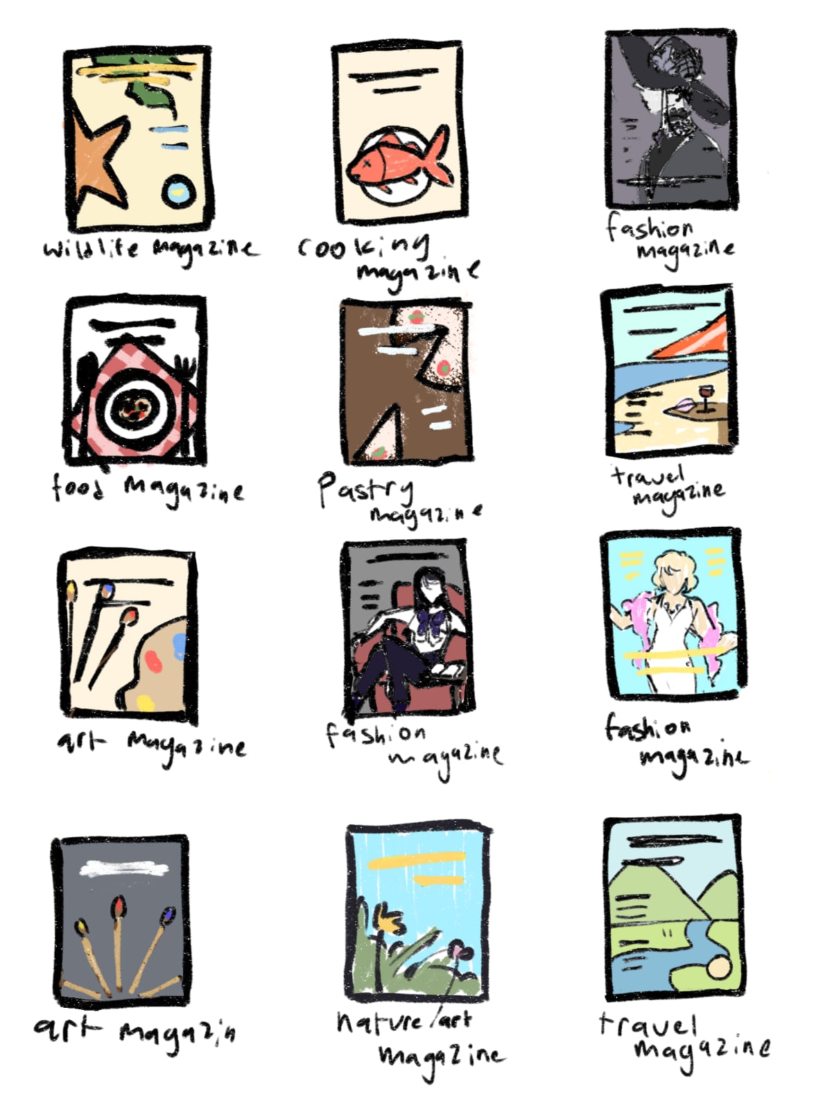
After this practice, I was more used to the act of generating ideas when previously I had the habit of just going with whatever idea I had first. I learned that through brainstorming like this, I could come up with multiple ideas which formed choices that allowed me to select something I felt would be most suitable
For my cover, I immediately knew I wanted the main image to look like it was being seen through night vision goggles as ghost hunters mostly go ghost hunting at night so needed to wear night vision goggles so I started with creating some quick small sketches of potential front covers to explore what I wanted and practice creating front covers.

I realized I liked the bottom left cover most since it involved a person holding a camera as if in attempt to capture supernatural phenomena which I felt best suited my magazine and since it also looked a bit retro which is one of the paranormal magazine conventions I intend to keep (because retro-styled images are often associated with spookiness due to it appearing older). So I went on Ibis Paint X to sketch my idea in greater detail. I felt I wasn't satisfied with how the colours turned out so I watched this video about colour theory to better understand how I can utilize it.


So far, I like the lower right magazine draft most as I really like how the green stands out against the monochrome grayscales. I think that will be the one I end up going for but I intend to do some further experimentation to confirm this choice.
Cover Mockup Shoot
I wanted to do some drafts of the cover before the final to ensure that this idea is effective for my magazine
I have 3 cameras I could use as potential props in my magazine. I wanted to see which of them best fit the composition of the cover so I created a draft for each of them


After my experimentation, I concluded that the first camera would act as a prop the best. Its size makes for better composition and as a vintage camera it suited the retro look I wanted to apply to my magazine.
Cover Mockup
Next, I decided to see how the image would look with the colours I wanted to use for the cover and how the I would apply the typography so I created a mockup

I think from this I can see that the background is too light. I think in the final version, I will include a darker background and
Reflection
- I think through this I was able to further develop my magazine through experimentation. Being able to experiment with elements, allowed me to ensure what would work best for my magazine.
No comments:
Post a Comment