Thursday, October 3, 2024

Brief

 This part of my blog will detail the brief for my component 3 project


Reflection:

  • This brief helped me understand the outline of our project and what I can expect which helped me prepare myself and encouraged me to start thinking about music videos by watching a lot of music videos to help me familiarise myself with them
  • Truthfully, I was not looking forward to this project. I was worried there may be conflicts due to differences in opinions. There was also the initial issue of everyone struggling to create groups as we were nervous about it. However, it turned out better than I expected as my teammates are more open to discussion than I had assumed and our teacher helped us through finding our groups a lot. This has taught me to trust others more in groupwork. As long as I dedicate myself to my parts, I should in turn trust them to dedicate themselves to theirs

Tuesday, October 1, 2024

Critical Self Reflection 1

 This part of my blog will detail my critical self reflection 1


Photo Editing Process

 This section of my blog will discuss the editing process of my magazine

Editing Research

I have never really done much editing before and I am generally unfamiliar with the process and program I am using so I looked at this tutorial to learn how I can edit


After watching this video, I understood how to navigate the program and how I could use the tools to create my desired photos

Photo Development

Front Cover


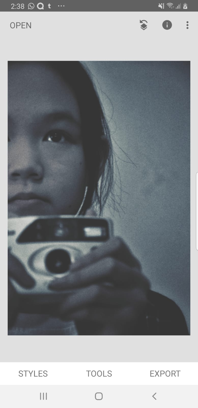
I started by simply making the image black and white using a filter. I wanted a black and white image as it made it appear more retro which is a convention of my genre according to my research as it connotes mystery. Black & white images also makes the image appear older which connotes history and links it with my main feature article


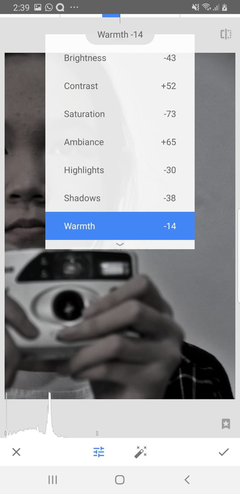
I then applied these changes to make the image contrast better


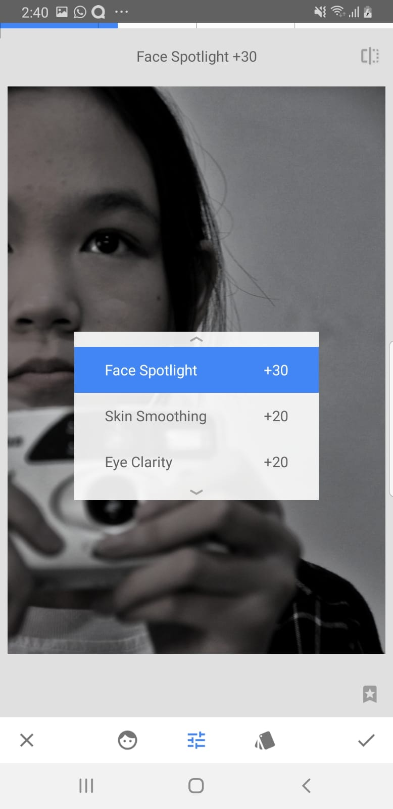
I also used the app's portrait features

I then made the outer brightness darker to create a light vignette effect which adds to the retro style as this effect is most often seen in old films and photos


I added a grain effect which also further contributes to the retro style as grainy images resemble how old films and photos look like


I then switched to using Ibis Paint X as it had a lot of filters I felt I could use and I intended to use it for creating my front cover. I added the border as it was an aspect of my front cover and I wanted to see how the changes would looks against the colour and style I was going for in my front cover. I changed the brightness and contrast accordingly to what I felt complimented the style better


Lastly, I added a posterize effect which made it appear a bit more cartoon-like. This was added because illustrations were a convention of paranormal magazines. It also made it appear more lighthearted and less serious which helped with the diversion uses & gratification

Contents Page


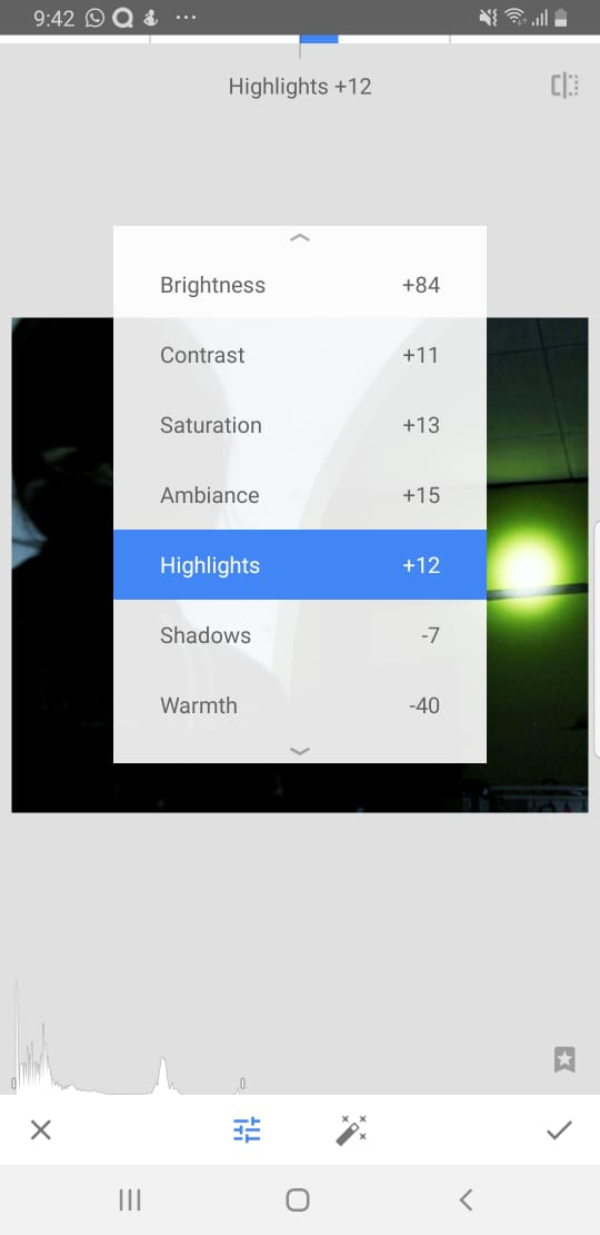
I started by tuning the image to make it pop out more. I made the image colder as blue tones connote mystery 


I also used the select tool to make certain aspects of the image brighter which helped balance it and make it appear more visible

Reflection:
  • I'm not familiar with image editing so I often worry if my edits came off as 'too much' or weren't as effective as I thought they were but Snapseed's feature that allows you to directly compare the original and edited image helped me understand what has changed and whether my changes were helping or not
  • I've gained a lot of editing skills through this. I now understand how certain effects in the editing may impact an image as a whole and how I can use it to create meaning

Saturday, September 28, 2024

Audience Feedback

 This part of my blog will detail my audience feedback

After creating the very first draft of my magazine, I asked others for feedback on my magazine in order to improve it


What the audience liked:

  • Masthead
  • Main cover image
  • Colour
  • Subheadings in article
  • Font
Changes to be made based on feedback:
  • Add more magazine elements
  • Content page colour palette
Suggested website features:
  • Gallery (for images)
  • Forum
  • Quizzes
Reflection:
  • I found asking people for feedback really helpful as they provided me with a fresh new perspective which allowed me to understand what worked for my audience and what needed improvement

Colour Theory Research

This section of my blog will consist of my colour theory research. This was originally a part of my blog titled 'Front Cover Development' created on the same date on 6th September. I've decided to move it to a new post entirely as I believe this research can be applied beyond just the front cover 

Colour theory is the idea that colours can be used together to not only create an effective and visually appealing design, but to communicate ideas through the usage of colours. Colour theory is an essential part of design that helps media producers visually communicate to their audience. Although I have a pretty good understanding of colour theory, I believe it would be helpful for me to learn more as well as revise my knowledge

I used these articles for my research:

Definitions:

  • Hue refers to the attribute of a colour that distinguishes a colour as a colour on the colour wheel
  • Value refers to how light or dark a colour is which helps create contrast and depth in a design
  • Saturation refers to the intensity of a certain colour which can range from saturated (vibrant) to desaturated (dull)

Colour Schemes

Colour schemes are combinations of colours. In design, colour schemes can be use to create an effective colour harmony. 

Types of Colour Schemes:

  • Monochromatic colour schemes are colour schemes that feature a single hue in different shades/tins, values and saturations. Using this type of colour scheme creates a feeling of minimalism
  • Analogous colour schemes use colours that are next to each other on the colour wheel. For example, a colour scheme that features, pink, orange and red. This creates a soothing design
  • Complementary colour schemes use colours on opposite sides of the colour wheel. For example, a colour scheme that features red and blue. Colour schemes like this are an effective tool for creating attention grabbing contrast which is why it's often used in media products for marketing (such as logos or adverts)
  • Triadic colour schemes feature colours that are placed equidistantly from each other on the colour wheel, forming a triangle. For example, a colour scheme that features green, orange and blue. Colour schemes like this usually create a fun and playful effect
  • Neutral colour schemes are colour schemes that rely on achromatic hues (black, white, grey) and neutral colours (desaturated colours, most often brown, beige and tan). This can make a calm, earthy and minimal feel

Colour Psychology

Colour psychology is the research into how people associate different colours with different things. In a visual media, this can help imply meanings to audiences by creating subconscious connections.

Warm Tones

Warm tones are typically associated with physically warmer things (like fire) and also emotionally warmer things (like joy or love). However, more specific colours can connotate more specific things. Most common associations include
  • Red: Love, passion, anger and danger
  • Orange: Courage, energy and immaturity
  • Yellow: Joy, optimism and illness
  • Pink: Femininity, romance and affection

Cool Tones

On the other hand, cool tones are associated with physically colder things (like ice) and emotionally colder things (like sadness or loneliness). More specific colours can also connotate more specific things including:
  • Green: Health, nature, money and envy
  • Blue: Trust, freedom and sadness
  • Purple: Nobility, wealth and fear

Reflection:

  • Truthfully, doing research into a topic I already know felt pointless but when conducting this research I realised that there were a few elements of colour theory that I had forgotten about such as specific terminology. In the end, it was useful as this revision helped me refresh my knowledge and better apply it to my magazine. I also was reminded of the terminology I can use when discussing colours

Typography Research

This section of my blog will consist of my typography research. This was originally a part of my blog titled 'Front Cover Development' created on the same date on 6th September. I've decided to move it to a new post entirely as I believe this research can be applied beyond just the front cover

Typography is essential in any media product that consists of text as it contributes to effectiveness meaning can be communicated to an audience. Not only does it make information easier to read, it also helps catch an audience's attention through design. I have very limited typography knowledge so to combat this and ensure that my magazine effectively resonates with my audience, I did some basic typography research.

I used these articles:
Here are the key points of what I learned summarised:

Definitions:

  • Typography is a component of design that refers to the art of arranging letters based on composition and style to create a cohesive and appealing display.
  • typeface is a stylized collection of letters. Each typeface can communicate different connotations (for example, serif fonts are often used in paperwork as they are associated with formality)
  • baseline refers to the invisible line that a text is placed on
  • cap height refers to the height of a typeface's capital letters measured from the baseline
  • Weight refers to the line thickness of a font. Typefaces usually come in 4 to 6 different weights, from light, regular, medium and bold.

Typefaces mainly come in these types:

  • Serif fonts are fonts with little shapes that appear at the beginning or end of each stroke on a letter. Well known examples include, Times New Roman and EB Garamond. Up until the 19th century, books and pamphlets were only ever written in serif fonts thus creating the psychological association with formality.  It communicates stability, intellect and authority.
  • 'Sans' is the French word for 'without' so, sans serif fonts are fonts without the little shapes on serif fonts. Examples of sans serif fonts include, Arial and Helvetica. Sans serif fonts were invented in the 19th century but only become popular in the 20th century as a part of the modernist movement. Culturally, sans serif fonts represent a break from tradition and have created the psychological association with progress and modernity. These make them excellent for creating bold and innovative typography.
  • Handwriting or script fonts are unconventional fonts that mimic natural handwriting. Examples include, Indie Flower and Dancing Script. Fonts mimicking calligraphy usually invoke a sense of sophistication and luxury while fonts that mimic regular handwriting are more informal and invoke a sense of creativity and youth
  • Display fonts are fonts that are typically only suitable for large point sizes and mostly used for its stylization to make a design look more eye-catching. Examples include Lobster and Silkscreen. Different display fonts could mean different connotations but generally, as they are used to catch an audience's attention, they are created to stand out meaning they can make a design appear more exciting and interesting while creating a sense of individuality.

Hierarchy of Type

My teacher advised me to look into the hierarchy of type which was a way to guide the audience to the information you wanted them to see using typography.

I used this video to help me gain a quick understanding of it


Previously, I hadn't heard of this. After watching this video, I better understood how I could create effective audience engagement by guiding their eye towards the information I want them to see and the order I want them to see this in. I can do this by making more important text larger or in a different colour which makes certain text appear more prominent

Reflection:
  • As I previously had very little experience in typography, this research helped me a lot by allowing me to gain an understanding how typography elements can contribute to creating an effective typography. It allowed me to create a visually appealing and readable design

Tuesday, September 24, 2024

Research: Audience

This part of my blog will detail my research into the potential audience for my product

I created a survey to better my audience and how I can appeal to them. This survey included basic questions such as age, gender and whether they liked reading magazines. It also includes some more specific questions such as articles they would be interested in reading or what magazine name they liked best.

As I wanted an international audience, I tried to share with as many people as possible. I shared this with friends and on social media (Instagram, Tumblr etc.) while encouraging them to share too which ensured that I could reach people from different parts of the world


Here are some of the significant results:

A lot of the results had affirmed my assumptions such as my audience being of mixed genders and mostly being of a similar age to me, however, there are some results I had not expected and will affect the direction I plan to take with my magazine

1


I had expected most people to be interested in ghost hunting/exorcism as most popular horror media seem to be about that topic. However, 35% of my audience seems to enjoy cryptozoology most which I believe is a good thing as, not only am I most passionate in it, it serves one of my product's purpose to discuss paranormal beliefs from different cultures and I think this would be a good opportunity for that since it would let me discuss cryptids from different various different cultures. I think the most popular options here could be used as inspiration of what I could include in my skyline

2


Initially I wanted a shorter name like 'Mystic' and felt as though the longer names weren't very good but according to the results, over 50% of my audience prefer the name "Timely Terrors" which I will now use for my magazine as it seems to attract audiences best

3


This result was really unexpected for me as I thought people would be less interested to hear about other paranormal themed media. I intended this question to help determine which article I should write, however, I feel like the results of this question may be biased due to the fact that I am active in the Magnus Archives fandom on my social medias so, because of this, I will write the second most popular article instead. I will use it as one of my main cover lines on the front cover though as I don't want to ignore the results. The other popular results will also be featured as cover lines too as, according to the results, they attract the most audiences.

Other responses:


This question has provided a lot of insight on why audiences consume paranormal-related media. Most often people said it was for the thrill, fascination or simply just for fun but this response sticks out to me as, unlike most people, they focus on the storytelling aspect rather than the factuality of it. I find this to be an interesting approach I could potentially apply to my content

Reflection:
  • I was actually pretty excited to do the audience research as I wanted to know how my audience would feel about my product. I was curious to what people found fascinating in niche genres like mine. It ended up really useful as it helped me decide what I could do to appeal to my audience. I understood what content they wanted to see and that my magazine would be mainly used for the uses and gratification of surveillance and diversion. I then used their responses to curate the magazine that would satisfy my audience by including the content they wanted to see (History of Ghost Hunting, Fiction Spotlight etc.) and making my magazine more informative while maintaining a lighthearted feel