This part of my blog will detail my magazine research
What is a magazine?
A magazine refers to form of media that typically resembles a thin book, featuring various articles & images, which are usually published periodically (monthly, weekly etc).

This section of my research will involve multiple genres of magazines I have gathered from the school library. My aim here is to figure out which genre of magazine I would find most interesting to create for comp 1.
Sharks Rulers of the Deep (National Geographic)

.jpeg)


- I think the way the front cover was designed was really well-done. The typography used on the title & subtitle creates a bold feeling due to the capitalization + simple font and the usage of red against the blue background. It also features a single shark in an empty background of the ocean which isolates the subject and makes it appear more powerful
- The wording used on the subtitle also creates a sense of power. "Rulers of the Deep" puts emphasis on this. The reader may gather that sharks are powerful predators in their ecosystem.
- The contents page is simple and bold. It gets to the point and is easy to understand while still providing a little further context (on the image used)
- The content of the magazine itself are also really well-done and informative. It emphasizes that although powerful, sharks are misunderstood creatures. Despite already believing this as a huge fan of sharks, after reading I reflected on how the rhetoric of certain media texts may influence an audience (media texts such as Jaws may cause an audience to fear sharks whereas one such as this magazine could cause them to grow fond of sharks). This reminds me of a lesson I a
- I enjoyed the variety of shark breeds shown in the magazine.
- I am not a huge fan of the image on the contents page simply because I personally don't find it that interesting. It doesn't seem too clear what the sharks are doing and it seems, to me, like a picture taken on accident as it doesn't really make sense.
- Although I like the contrast of red against blue as complimentary colours work really well to create that boldness the creators of this magazine seem to be going for, I think that the red subtitle does not stand out well since the saturation of the colours are too close to each other.
Secret Societies (National Geographic)

.jpeg)
.jpeg)
Genre: Historical
Uses & Gratification: Surveillance
Demographic & Psychographic:

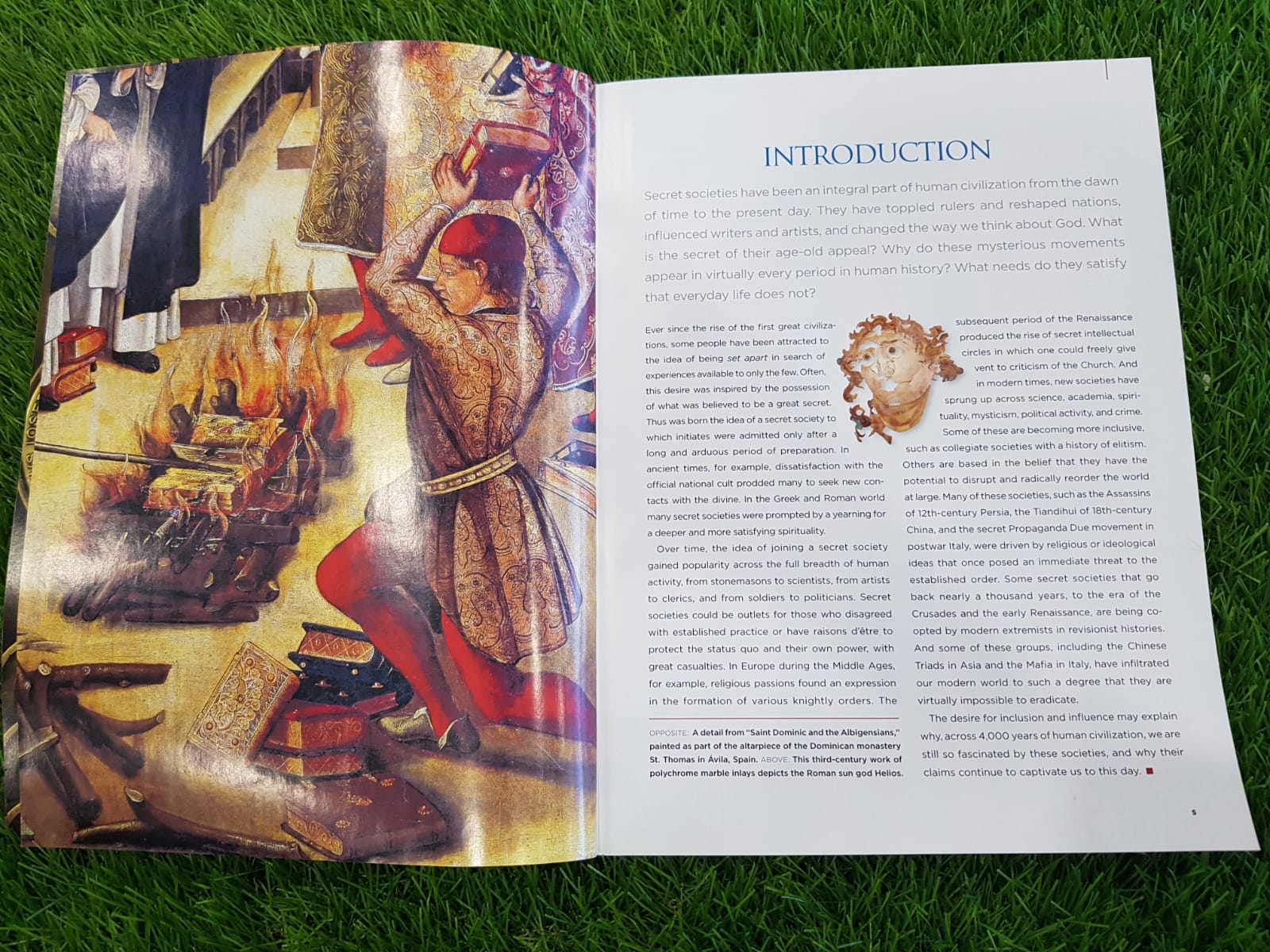
- The image used on the cover implies that there is some sort of mystery in the topic being discussed as it is an ominous stone structure that looks ancient, leaving the viewer wondering what it could be about
- The contents page is really beautifully designed. The image communicates the sense of secrecy; a hand reaching for a sort of contraption. The mise-en-scene of this image makes it look rich and luxurious, perhaps we can gather that secret societies are a common thing among the elite. The font used on this page matches that idea as it looks very formal.
- The introduction page features a renaissance-styled painting of what looks to be a person burning tomes in front of a crowd. Perhaps this implies the odd activities that secret societies partake in or that secret societies aren't particularly looked well upon by society. Regardless, the usage of a renaissance-styled painting fits with the discussion of historical concepts in the magazine.
Disliked:
- I feel like the font and colours used on the cover page of the magazine doesn't really fit well with the rest of the magazine and overall theme. Perhaps if they used a font more like the ones used on the content and introduction page, I would prefer it. I also understand that the usage of yellow is to probably match the signature yellow that National Geographic uses but it is a colour heavily associated with happiness which I feel like does not align well with the mysterious feeling that the magazines seems to be going for.
- I also feel like the font used on the top text of the contents page (font used for the word 'CONTENTS') does not match but I suppose it makes the overall design feel more balanced as it matches the rest of the unmatching font
Conclusion:
This magazine introduced me to more unorthodox magazine topics which I had previously assumed were usually not discussed in magazines. This widens my scope of choices a bit and now I am realizing that I can do more than just the more commonly seen magazine genres (fashion, travel etc.). I think I want to do something that's spookier. Maybe a crime or even paranormal magazine?
A-ONE
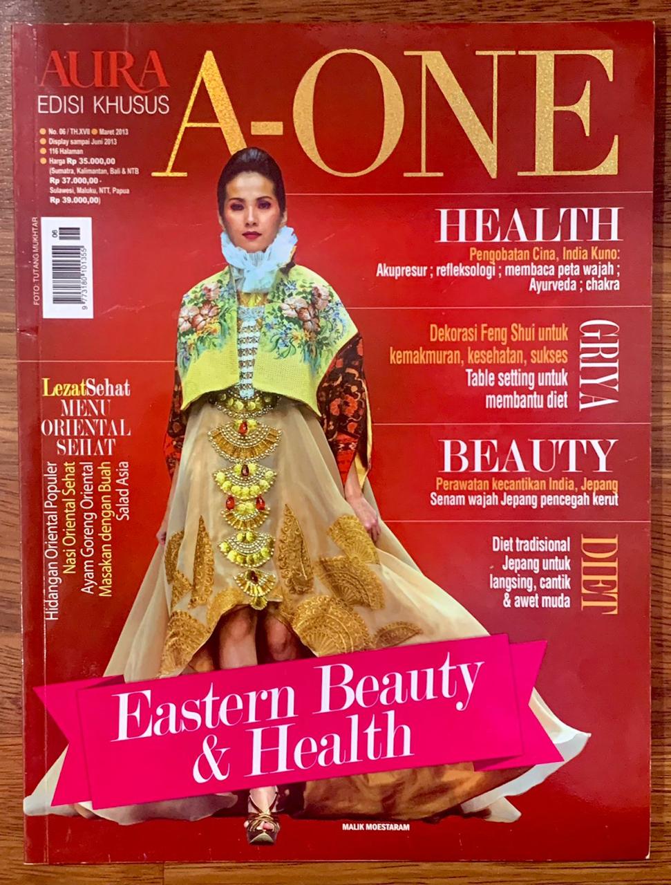
Genre: Fashion
Uses & Gratification: Personal Identity, Surveillance
Demographic & Psychographic:

- I love the use of red. Since the magazine is focused on East Asian beauty and health, it makes sense to use a lot of red since it symbolizes good luck in China. It also just makes the magazine look more striking and contrasts well with the other colours used. Along with the white and gold, it becomes elegant.
- The typography varies throughout the magazine. Although it makes it feel more cluttered, it makes this makes the magazine appear more interesting and appear more fun which is what I think it is going for.
- I hate the way the main cover line, "Eastern Beauty & Health" covers a part of the model on the front page. I feel like it's unnecessary to include this as it just makes the magazine appear cluttered. It would have been better to not include it as it it would allow more of the model to be shown which I feel like is important for a fashion magazine. It also would have made the magazine looked more elegant especially since the pink looks so out of place with the other colours
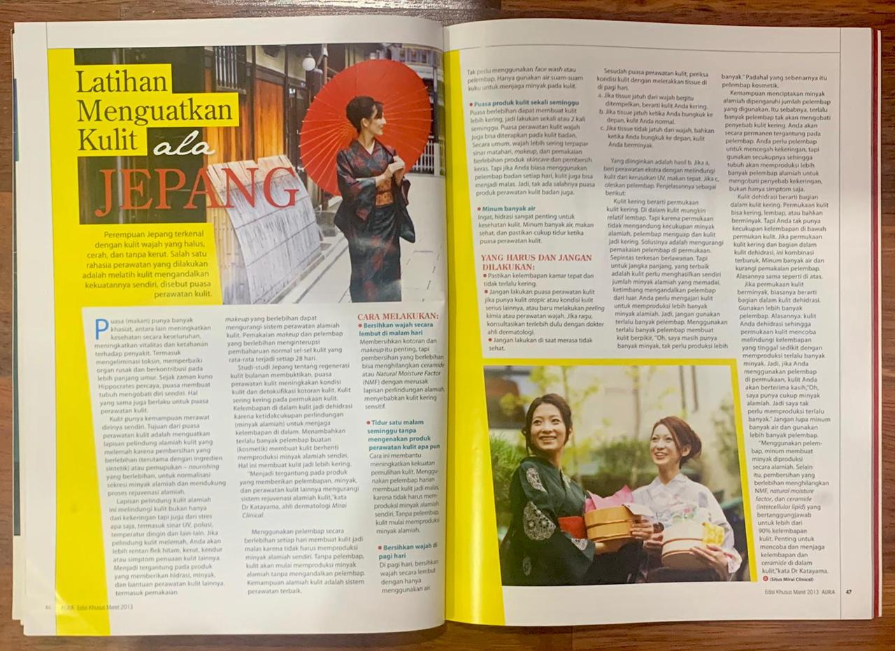
- On the article page, the word "Jepang" doesn't really contrast well with the background which makes it a bit hard to read and also considerably less striking
Fall Recipes (Better Homes & Gardens)


Uses & Gratification: Surveillance
Demographic & Psychographic:

Liked:
- I love how clean and simple the magazine looks. Information is not cluttered. The colours do not clash together and the typography maintains boldness while not taking away focus from other information on the magazine. It reminds me almost of the menus you often see in restaurants
- The magazine keeps a 'warm and cozy fall' feel by maintaining a warm colour palette
- I don't think there is anything I dislike about this magazine. Maybe if I had to criticize it, it could include more fall imagery in its design but that's all.
Paranormal Magazine Conventions:
- Mostly monochrome (when containing colours it's usually red, green, blue or yellow)
- Harsh typography
- Featuring something 'spooky' (monsters, cryptids)
- Dark lighting
- Retro appearance
Fourtean Times

Media Language

- Their cover image features fish raining down on a city which illustrates their featured article (about a rain of fish) which is an anomalous weather phenomena. The colour used here further emphasizes that abnormality as the fish are coloured pink which is not a normal fish colour. By doing this, the magazine subverts from the typical paranormal magazine conventions which also adds to their connotation of abnormality.
- The language used in the coverlines also further emphasizes the 'weirdness' connotation of the phenomena. 'Cloudy with a Chance of Fish' is play on how weather is commonly reported by weather reporters but instead of the normal 'Cloudy with a chance of [rain, wind etc.]', it is 'cloudy with a chance of fish' which not only teases the content of the featured article to the reader but shows the connotations to the audience how weird the phenomena they report on is.
- The parts of the coverline that are selected and enlarged are the parts that emphasize 'weirdness'
- The magazine's selling line further contributes to their identity of 'weird' through the usage of the word 'strange'
Representations
Audience
- It can be assumed that the demographic is younger people (15-25) as the magazine uses a casual mode of address which appeals to a younger audience as younger people are still maturing hence prefer something less mature. However, since Fourtean Times is an older magazine (first issued November 1973), the target demographic's age could be stretched as there may be older people (25+) who have read the magazine since they were younger and still continue to enjoy it as they age as they've become used to it.
- The target demographic could be people of all genders as the magazine doesn't seem to be leaning to more feminine or masculine topics/content
- The audience could be reading the magazine for surveillance and social relationship uses & gratifications. This is because information on anomalous phenomena is uncommon so, for those who have an interest in understanding anomalous phenomena, this magazine could serve as the source for that information and, since information on such topics is uncommon, people interested in this magazine could form social relationships with others who read this magazine as a way of meeting others with similar interests (anomalous phenomena)
- It could also be for the use & gratification of diversion as the mode of address is casual, making the magazine feel less serious and more entertaining.
Industry
Fate

Media Language

- Unlike most magazines, Fate includes considerably less information on their front covers, causing more empty space, which sets them apart from other magazines. Through this, they may have the preferred reading of being unorthodox just as the topics they discuss
- Fate's cover lines are are short and don't really tease much of its contents beyond the general idea. This follows the last point of having less information on their front covers unlike most magazines. This is also further emphasized by subverting from regular paranormal magazine conventions and using simpler bolder typography rather than the expected harsher serif fonts. By doing this, their articles sound more mysterious which would intrigue audiences and encourage them to read the magazine to discover what the contents may be about. As they often discuss paranormal topics, creating a sense of mystery in the audience through the language they use may be an effective way of attracting their target demographic
- Their selling line, "True reports of the strange and unknown", suggests that they prioritize factual information in their articles. Since their target audience may be consuming media for the uses & gratification of surveillance, this selling line tells them that this magazine will give them what they want.
Representations
Audience
- Fate is an old magazine that retains a retro style which may cause it to appeal to older audiences better.
- As Fate's tagline is 'True reports of the strange and unknown", they have a rhetoric that states their accounts are factual therefore would attract those interested in knowing honest accounts of anything 'strange and unusual' which would usually be the paranormal
Industry
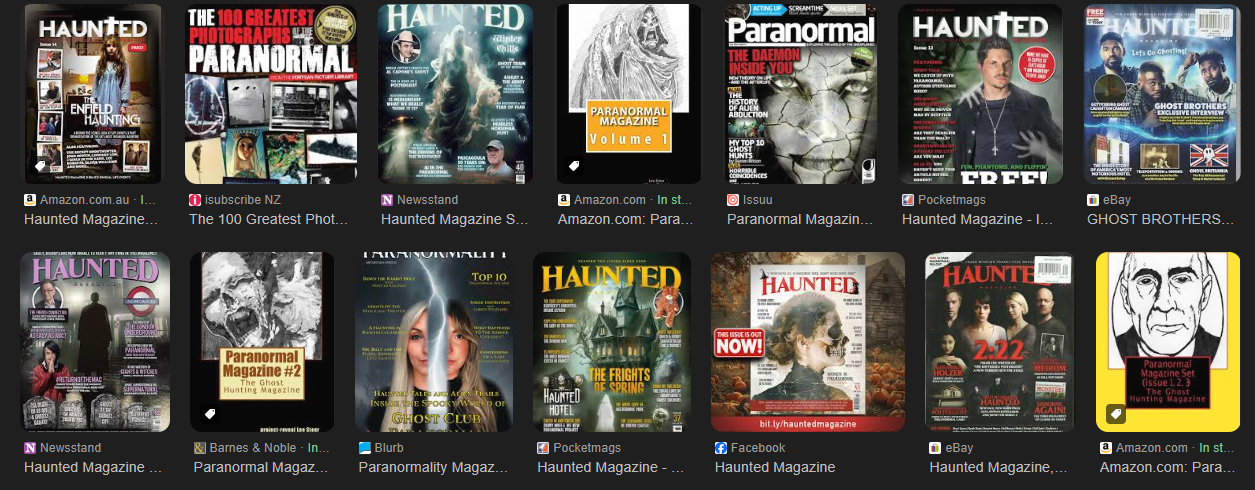
Haunted

Media Language
Representations
Audience
Industry
Skeptical Inquirer

Demographic & Psychographic:

Likes:
- I like the retro style of the illustration. I think a retro style suits a paranormal magazine as older things are often associated with being haunted
- Colour: Aliens are depicted as green so the colour green would be hermeneutic code for the extraterrestrial. Paired with the random objects floating about the illustration, it makes it appear like an alien abduction
Dislikes:
- I feel like the lack of coverlines included in the cover would make it ineffective in attracting target audiences as coverlines would typically provide insight into the contents of the magazine which would intrigue audiences and encourage them to purchase the magazine
Application:
- I already intend to apply a retro style to my magazine but this magazine has served as further inspiration for this intention
- I like the focus on investigation and factual information on this magazine therefore I intend to enforce these rules in my own magazine
Cosmic Horror Monthly

Demographic/Psychographic:

Likes:
- The usage of red: In colour theory, red symbolises danger so when paired with the illustration, it may signal to the viewer that the creature depicted is something dangerous. Additionally, red is a complementary colour to blue which makes the blue used a great contrast to red. Blue is also often associated with sci-fi which becomes a hermeneutic code for the contents of this magazine.
Dislikes:
- Typography: Throughout the front cover, the magazine uses various different serif fonts. I feel like this prevents the typography from matching with each other which makes for a cluttered design
Application:
- Usage of colour theory: This magazine cover has reminded me the importance of colour theory in making an effective design. Therefore I will do more research into it and apply good colour theory in my design
Hellebore

Demographic/Psychographic:

Likes:
- The usage of colours: Green is colour most dominantly used and this is contrasted with its complementary colour, pink, which separates the rabbit from the rest of the background. Since the theme for this issue is animals, this might've been done to highlight a focus on the animal on the front cover (the rabbit).
Dislikes:
- The head of the model on the cover slightly obstructs the mast head which makes it a bit hard to read as the 'E' could be mistaken for an 'F' and the 'B' looks like an 'R'
Application:
- The way the colour contrasts here makes an excellent tool to guide the audience to the focus which I could attempt to apply in my own magazine
Apex Magazine

Demographic/Psychographic:

Likes:
- The composition of the magazine ensures that none of the information clash against each other, making it easy for the viewer to process. The text is easy to read and illustration isn't obscured by the other elements
Dislikes:
- I wish the magazine had more indications as to what the content of the stories inside were as that would've helped attract the target audience better as they would be able to determine if this magazine had what they were looking for
Application:
- This magazine reminds me to ensure that my composition works well so that information is not cluttered and so is easy to read
The Deadlands

Demographic/Psychographic:

Likes:
- I find the main cover image to be really creative. The Deadlands is a magazine that publishes written work regarding death so the scattered papers seem to resemble the various little stories that make up the magazine
Dislikes:
- It's unclear what the object on the middle right of the main cover image is supposed to be
- I feel like if the cover contained more clues on the content of the stories, it would attract audiences better
Application:
- I admire the simplicity of the typography on the magazine
Rue Morgue

Demographic/Psychographic:

Likes:
- The main cover image is a close up of the subject who stares at the audience which creates a direct mode of address with the audience which may create a connection with the audience making them more attracted to the magazine
Dislikes:
- Some of the text in the magazine' front cover is quite small, making it hard to read
Application:
- This magazine makes me consider how I could use different camera shots to entice my audience
- At first, having to do this much research felt very overwhelming. It was hard to find time between this and my other academic tasks especially. It felt really demotivating but when I actually started the task, I found myself really enjoying the analysing process which made me able to finish it faster and with more motivation
- This research really helped me familiarise myself with magazines (in my genre especially) and how they are typically formatted. This helped me a lot when I was coming up with ideas for my magazine as I understood how I could use conventions in my product