Saturday, September 28, 2024

Audience Feedback

 This part of my blog will detail my audience feedback

After creating the very first draft of my magazine, I asked others for feedback on my magazine in order to improve it


What the audience liked:

  • Masthead
  • Main cover image
  • Colour
  • Subheadings in article
  • Font
Changes to be made based on feedback:
  • Add more magazine elements
  • Content page colour palette
Suggested website features:
  • Gallery (for images)
  • Forum
  • Quizzes
Reflection:
  • I found asking people for feedback really helpful as they provided me with a fresh new perspective which allowed me to understand what worked for my audience and what needed improvement

Colour Theory Research

This section of my blog will consist of my colour theory research. This was originally a part of my blog titled 'Front Cover Development' created on the same date on 6th September. I've decided to move it to a new post entirely as I believe this research can be applied beyond just the front cover 

Colour theory is the idea that colours can be used together to not only create an effective and visually appealing design, but to communicate ideas through the usage of colours. Colour theory is an essential part of design that helps media producers visually communicate to their audience. Although I have a pretty good understanding of colour theory, I believe it would be helpful for me to learn more as well as revise my knowledge

I used these articles for my research:

Definitions:

  • Hue refers to the attribute of a colour that distinguishes a colour as a colour on the colour wheel
  • Value refers to how light or dark a colour is which helps create contrast and depth in a design
  • Saturation refers to the intensity of a certain colour which can range from saturated (vibrant) to desaturated (dull)

Colour Schemes

Colour schemes are combinations of colours. In design, colour schemes can be use to create an effective colour harmony. 

Types of Colour Schemes:

  • Monochromatic colour schemes are colour schemes that feature a single hue in different shades/tins, values and saturations. Using this type of colour scheme creates a feeling of minimalism
  • Analogous colour schemes use colours that are next to each other on the colour wheel. For example, a colour scheme that features, pink, orange and red. This creates a soothing design
  • Complementary colour schemes use colours on opposite sides of the colour wheel. For example, a colour scheme that features red and blue. Colour schemes like this are an effective tool for creating attention grabbing contrast which is why it's often used in media products for marketing (such as logos or adverts)
  • Triadic colour schemes feature colours that are placed equidistantly from each other on the colour wheel, forming a triangle. For example, a colour scheme that features green, orange and blue. Colour schemes like this usually create a fun and playful effect
  • Neutral colour schemes are colour schemes that rely on achromatic hues (black, white, grey) and neutral colours (desaturated colours, most often brown, beige and tan). This can make a calm, earthy and minimal feel

Colour Psychology

Colour psychology is the research into how people associate different colours with different things. In a visual media, this can help imply meanings to audiences by creating subconscious connections.

Warm Tones

Warm tones are typically associated with physically warmer things (like fire) and also emotionally warmer things (like joy or love). However, more specific colours can connotate more specific things. Most common associations include
  • Red: Love, passion, anger and danger
  • Orange: Courage, energy and immaturity
  • Yellow: Joy, optimism and illness
  • Pink: Femininity, romance and affection

Cool Tones

On the other hand, cool tones are associated with physically colder things (like ice) and emotionally colder things (like sadness or loneliness). More specific colours can also connotate more specific things including:
  • Green: Health, nature, money and envy
  • Blue: Trust, freedom and sadness
  • Purple: Nobility, wealth and fear

Reflection:

  • Truthfully, doing research into a topic I already know felt pointless but when conducting this research I realised that there were a few elements of colour theory that I had forgotten about such as specific terminology. In the end, it was useful as this revision helped me refresh my knowledge and better apply it to my magazine. I also was reminded of the terminology I can use when discussing colours

Typography Research

This section of my blog will consist of my typography research. This was originally a part of my blog titled 'Front Cover Development' created on the same date on 6th September. I've decided to move it to a new post entirely as I believe this research can be applied beyond just the front cover

Typography is essential in any media product that consists of text as it contributes to effectiveness meaning can be communicated to an audience. Not only does it make information easier to read, it also helps catch an audience's attention through design. I have very limited typography knowledge so to combat this and ensure that my magazine effectively resonates with my audience, I did some basic typography research.

I used these articles:
Here are the key points of what I learned summarised:

Definitions:

  • Typography is a component of design that refers to the art of arranging letters based on composition and style to create a cohesive and appealing display.
  • typeface is a stylized collection of letters. Each typeface can communicate different connotations (for example, serif fonts are often used in paperwork as they are associated with formality)
  • baseline refers to the invisible line that a text is placed on
  • cap height refers to the height of a typeface's capital letters measured from the baseline
  • Weight refers to the line thickness of a font. Typefaces usually come in 4 to 6 different weights, from light, regular, medium and bold.

Typefaces mainly come in these types:

  • Serif fonts are fonts with little shapes that appear at the beginning or end of each stroke on a letter. Well known examples include, Times New Roman and EB Garamond. Up until the 19th century, books and pamphlets were only ever written in serif fonts thus creating the psychological association with formality.  It communicates stability, intellect and authority.
  • 'Sans' is the French word for 'without' so, sans serif fonts are fonts without the little shapes on serif fonts. Examples of sans serif fonts include, Arial and Helvetica. Sans serif fonts were invented in the 19th century but only become popular in the 20th century as a part of the modernist movement. Culturally, sans serif fonts represent a break from tradition and have created the psychological association with progress and modernity. These make them excellent for creating bold and innovative typography.
  • Handwriting or script fonts are unconventional fonts that mimic natural handwriting. Examples include, Indie Flower and Dancing Script. Fonts mimicking calligraphy usually invoke a sense of sophistication and luxury while fonts that mimic regular handwriting are more informal and invoke a sense of creativity and youth
  • Display fonts are fonts that are typically only suitable for large point sizes and mostly used for its stylization to make a design look more eye-catching. Examples include Lobster and Silkscreen. Different display fonts could mean different connotations but generally, as they are used to catch an audience's attention, they are created to stand out meaning they can make a design appear more exciting and interesting while creating a sense of individuality.

Hierarchy of Type

My teacher advised me to look into the hierarchy of type which was a way to guide the audience to the information you wanted them to see using typography.

I used this video to help me gain a quick understanding of it


Previously, I hadn't heard of this. After watching this video, I better understood how I could create effective audience engagement by guiding their eye towards the information I want them to see and the order I want them to see this in. I can do this by making more important text larger or in a different colour which makes certain text appear more prominent

Reflection:
  • As I previously had very little experience in typography, this research helped me a lot by allowing me to gain an understanding how typography elements can contribute to creating an effective typography. It allowed me to create a visually appealing and readable design

Tuesday, September 24, 2024

Research: Audience

This part of my blog will detail my research into the potential audience for my product

I created a survey to better my audience and how I can appeal to them. This survey included basic questions such as age, gender and whether they liked reading magazines. It also includes some more specific questions such as articles they would be interested in reading or what magazine name they liked best.

As I wanted an international audience, I tried to share with as many people as possible. I shared this with friends and on social media (Instagram, Tumblr etc.) while encouraging them to share too which ensured that I could reach people from different parts of the world


Here are some of the significant results:

A lot of the results had affirmed my assumptions such as my audience being of mixed genders and mostly being of a similar age to me, however, there are some results I had not expected and will affect the direction I plan to take with my magazine

1


I had expected most people to be interested in ghost hunting/exorcism as most popular horror media seem to be about that topic. However, 35% of my audience seems to enjoy cryptozoology most which I believe is a good thing as, not only am I most passionate in it, it serves one of my product's purpose to discuss paranormal beliefs from different cultures and I think this would be a good opportunity for that since it would let me discuss cryptids from different various different cultures. I think the most popular options here could be used as inspiration of what I could include in my skyline

2


Initially I wanted a shorter name like 'Mystic' and felt as though the longer names weren't very good but according to the results, over 50% of my audience prefer the name "Timely Terrors" which I will now use for my magazine as it seems to attract audiences best

3


This result was really unexpected for me as I thought people would be less interested to hear about other paranormal themed media. I intended this question to help determine which article I should write, however, I feel like the results of this question may be biased due to the fact that I am active in the Magnus Archives fandom on my social medias so, because of this, I will write the second most popular article instead. I will use it as one of my main cover lines on the front cover though as I don't want to ignore the results. The other popular results will also be featured as cover lines too as, according to the results, they attract the most audiences.

Other responses:


This question has provided a lot of insight on why audiences consume paranormal-related media. Most often people said it was for the thrill, fascination or simply just for fun but this response sticks out to me as, unlike most people, they focus on the storytelling aspect rather than the factuality of it. I find this to be an interesting approach I could potentially apply to my content

Reflection:
  • I was actually pretty excited to do the audience research as I wanted to know how my audience would feel about my product. I was curious to what people found fascinating in niche genres like mine. It ended up really useful as it helped me decide what I could do to appeal to my audience. I understood what content they wanted to see and that my magazine would be mainly used for the uses and gratification of surveillance and diversion. I then used their responses to curate the magazine that would satisfy my audience by including the content they wanted to see (History of Ghost Hunting, Fiction Spotlight etc.) and making my magazine more informative while maintaining a lighthearted feel

Industry Research

 This part of my blog post will detail my research into the magazine industry

I think it's essential to understand the industry of the media text I am creating as a producer as it would help me better understand how magazines such as mine would be produced, distributed and marketed if it were a real product. So, I've decided to research more into different publishers in the magazine industry.

Hearst Magazines

Hearst Magazines

Founded

1887

Audience

According to their website, Hearst Magazine’s audience consist of:


-          195 million print readers worldwide

-          61% of US millennials (28-43 yr olds)

-          71% of US adult women

Circulation Figures

20 million magazines/yr

Most Popular Magazine

Good Housekeeping

 Hearst Magazines is one of the biggest magazine publishers worldwide with over 195 million print readers internationally. I decided to research it to gain an understanding of what large magazine publishers in the industry are like. 

Diamond Publishing

Diamond Publishing (Metropolis International Group)

Founded

2002

Audience


I struggled to find concrete data of their intended audiences, however, based on their publications, it can be assumed that their audience consists of:

-          British people

-          Older audiences

-          People interested in pop-culture

Circulation Figures

3.5 million magazines/yr

Most Popular Magazine

Fortean Times, Viz


Throughout this project, I've learned that paranormal is a very niche genre in magazines. When researching paranormal magazines, one of the magazines I would most often come across is Fortean TImes. To better understand publishers that work with more niche products, I thought it would be a good idea to research their publisher, Diamond Publishing. 

I noticed that looking for information on this publisher was significantly more difficult compared to when researching a more well-known publisher. Perhaps this is because they publish magazines in more niche genres (music, paranormal, cycling, comics) rather than genres that would more effectively appease the general market such as with Hearst magazines (fashion, home, health). I find this an interesting comparison as it helped me better understand the demand of the genres in the magazine market

Conclusion

From my research into the magazine industry, I better understand the behaviour of audiences who consume this sort of media. If my magazine were a real publication, it may not grow to be very popular but I find an opportunity in this. Niche markets often gather more loyal audiences as there are not much competitors so this would reduce the risk of my magazine failing as a product. Releasing a new media product to a general market can prove to be risky as the amount of competitors would act as a barrier to entry. If my genre was more general, I would have to think about what I could do to set my product apart from competitors which introduces more risks. Rather, I find it more valuable to be more sure of the long-term continuity of my product than being exposed to an 'easier' market with far more risks

Monday, September 23, 2024

Double Page Spread Research + Development

 This part of my blog will detail my research and development for my double page spread

Research

I struggled to find double page spreads of magazines that fit my genre so my double page spread research will consist of magazines in similar genres

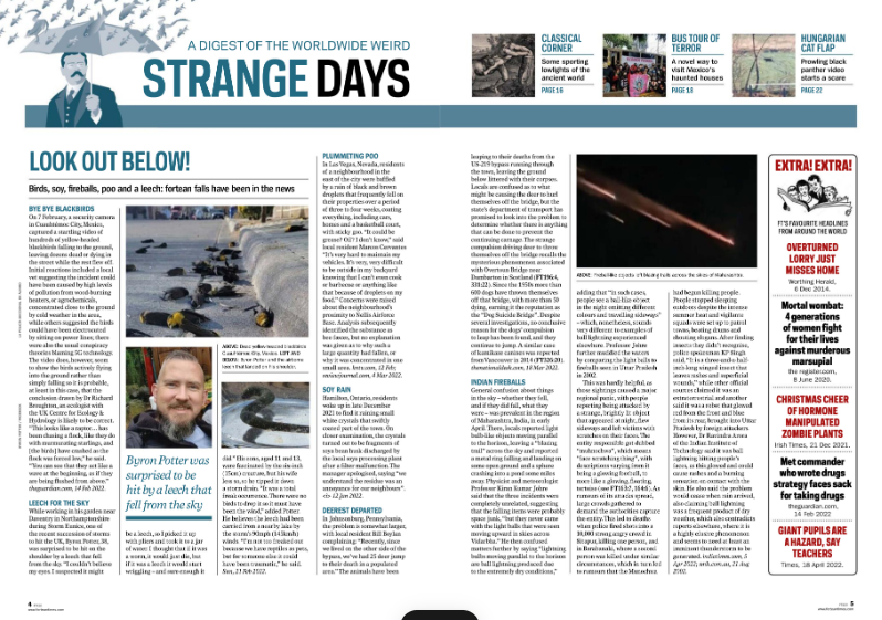
Fortean Times


Before Reading

Issue:

#420 July 2022

Publisher:

Diamond Publishing

Genre:

Esoteric, paranormal, occult

Images:

3 images are on the top right corner of the spread, these images are related to the other articles on the magazine and show the viewer where each article can be found.

3 other images lay on the left of the magazine, these pictures seem to be archival images of the strange weather phenomenon that the article is reporting on which gives the reader context into what happened during the phenomenon, making it feel more real.

On top of the left page is an illustration of a man holding an umbrella as fish (and some frogs) pour from the sky. This is to highlight the magazine’s feature article and connects it with the image of raining fish on the front cover. Blue is used to again create the association with weather as we associate rain/cloudy weather with dull blues. The weather phenomenon is odd yet the man looks undisturbed, this gives the illustration an almost dream-like quality which fits into the surreal themes of the magazine.

On the left is an image of fireball-like objects falling from the sky. The image looks to be an archival image which again gives the viewer some context into what happened on the day which makes the magazine feels more immersive.

The magazine features a lot of images scattered about which make it feel sort of messier and overloads the reader with visual information of weird weather phenomenon which makes the magazine feel more surreal

Layout

The magazine is packed with information featuring many different columns that each contain a different weather phenomenon. The magazine’s layout feels tight and it overloads the viewer with all this weird weather phenomenon which stimulates the viewer’s curiosity and allows the reader to easily binge read all its contents

First impressions:

I really like this spread as it feels very surreal to me which I find suits the paranormal genre. However, it also feels cluttered which, although may serve the magazine’s intention of fitting a lot of information well, it personally makes it feel a bit overwhelming for me

After Reading

Heading:

“STRANGE DAYS”

Subheading:

“LOOK OUT BELOW!”

Author:

The spread mentions no author and no photographer

Article:

The article contains short reports on various weird weather phenomena. These phenomena are reported scientifically and factually, perhaps the message is that these weird weather phenomenona have natural scientific messages

Mode of address:

The writing style is very formal and does not directly address the audience. However, the headings often feature less serious wording which might be to capture audience attention

Pull Quote:

There is one pull quote that says “Bryon Potter was surprised to be hit by a leech that fell from the sky.” This pull quote is coloured blue and enlarged which makes it stand out which might be to catch the attention of readers who are quickly flicking through the magazine so they would engage with the text. The quote is also effective at doing this as being hit by a leech from the sky is most likely an event that most people have not experienced or heard of therefore catching their intrigue

Audience:

Young people (aged 15-30) as younger people are often less mature and value fun, the magazine uses less serious wording that emphases the wild nature of these events. They don’t have any stereotypically feminine or masculine elements so they’re most likely appealing to all genders. This magazine targets people who find weirder topics more fascinating as this article discusses weird weather phenomena. They target these people by making emphasizing the weirdness of their articles through the headings and the images (such as the image of a man being rained on by fish).

Impression:

I found this article to be really fun as it was interesting to learn about topics you don’t hear about every day. I’ve never heard of these weather phenomena before so I find it fascinating. It was also really easy to read because the article is divided into sections and included many different topics which made it easier to digest

Inspiration:

I really like the usage of subheadings to divide the content as it made it simpler to read and understand so I intend to use it in my article as history is a topic that most people may find boring


National Geographic Secret Societies

Before Reading

Issue:

January 2020

Publisher:

Meredith Operations Corporation

Genre:

Historical, cults, theology, occult, esoteric

Images:

The main image of the double page spread features a low angle shot of a grandiose tomb. The low angle makes the tomb appear more powerful and features orange hues which is associated with gold therefore making it appear even more grandiose. The small damages signify age but the tomb still overall looks uncorroded which makes it appear even more powerful

It features another smaller image of a mask. This mask is also gold which again connotates grandiosity.

The article is about ancient times and we associate this with fancy grandiose architecture and colours such as white and gold which is frequent throughout the magazine. We also associate ancient history with time so the more corroded the building, the more we make the connection with old age

Layout

The layout features a lot of negative space on around the text which gives it a more spacious feeling, this makes the text less intimidating for the audience and easier to read. Perhaps this is because audience often think of history as boring so the text is made more digestible for the reader’s enjoyment.

First impressions:

I think the grandiosity emitted by the spread makes it appear more vintage which I personally like a lot and I think it also does an effective job of pulling the audience in as it made it makes you feel as if your learning about something great and ancient

After Reading

Heading:

ANCIENT TIMES

Subheading:

“A YEARNING FOR DEEPER SPIRITUALITY INSPIRES OCCULT AND ESOTERIC MOVEMENTS”

Author:

The spread features no byline and mentions no photographer but tells the reader what the images are supposed to be on the bottom of the second page

Article:

It tells the audience that even in ancient times, we have always yearned for spirituality. Spiritual beliefs are said to reflect human desire. Perhaps this magazine is telling us that spirituality mainly stems from stories told out of human desire rather than evidence. It then tells us that spirituality is associated with the elite (which could be the reason the magazine is designed to feel fancy), causing other loyal believers to form their own secret societies out of dissatisfaction. Stereotypically, secret societies are often portrayed negatively but here the article mentions that it is instead regular people who have grown dissatisfied with how spiritual systems benefits only those in power and for desire of exclusivity

Mode of address:

Formal and serious. I feel this suits the magazine best as it is a historical magazine that focuses on facts

Pull Quote:

No pull quotes

Audience:

Young people (perhaps 16-25) who enjoy history, theology and/or the occult. I suggest it’s younger people as the language used is simple and made easily digestible for the audience and as the magazine discusses topics about spirituality, secret societies and cults in history, it can be assumed that people into these topics are the target audience. They try to attract these readers pretty directly and upfrontly through images that depict objects related to spirituality and history as well as the typeface they use to create a sort of grand ancient feeling

Impression:

History is not my biggest interest so it was natural that I found it a little boring. However, I find it easy to read regardless and I find the way they discuss spirituality and secret societies to be an interesting perspective to think about. I find that media that divert from stereotypes and offer a new perspective to be worth thinking about

Inspiration:

Since my target audience is of the same age and my article will be related to history too, I will keep in mind that I should keep information digestible for them and easy to read. I also found it interesting that they were able to offer me a new perspective so I will consider how I might be able to do that with my audience as well

Development

I started by brainstorming some double page spread ideas through sketching


I struggled to select which layout to pick however I went with the second one on the left as I felt like the way the columns were structured would fit a historical article best

I then went on Canva to create the layout for my double page spread


These were my very first double page spreads. I struggled with selecting whether black or white fit best so I asked my teacher for feedback


He suggested that me to change the green of the banner and made the white one more off-white. He also suggested some layout changes to my magazine to help it match the magazine standards better (drop cap, captions, pullout)


I asked my a few friends for feedback on which of the colours suited better and everyone was pretty divided on whether they think black or white was better which left the decision up to me. I decided to go with black as black being a main colour matched my house style. That way it wouldn't feel out of place with the front cover and contents page.

A friend then suggested using lace to decorate the pages as lace is associated with the Victorian era (which is discussed in my article) therefore connoting history. I experimented with her suggestion to see if fit


I felt like using a lacey boxout would fit best as wasn't as obstructive which was what I ended up going with.


As I struggled with deciding the layout, I did a lot of experimentation to see which would fit best.


In the end I decided to go with this one. I felt this was best as the pull quote, lace boxout and large image was best to catch the attention of audiences who were quickly flipping through the pages. That way I could keep audience engagement.

Reflection:
  • Out of all the pages, the double page spread was what I struggled with most. I ended up needing to ask for a lot of feedback from my teacher and opinions from my audience. I spent a lot of time on it but through this I was able to create something that felt satisfactory

Content Page Research + Development

 This part of my blog will detail my content page research and development

Research

As I struggle to find content pages online for my genre as it's very niche, a lot of my content page research will consist of content pages for similar genres instead

Fortean Times


Media language:

  • The largest image on the contents page features a close up of a fish being held which alludes to the magazine's main article. This promotes the main article further and keeps it as the highlight of the magazine
  • The typography here is bold and simple which makes the contents page easy to read. This is important as the contents page tells the audience what they can expect in the magazine and ensure they stay intrigued

Likes:

  • I like how organized the content page is. It's divided into section which makes it easy to understand the magazine's format

Dislikes:

  • I feel like the contents page is a bit out of place from the rest of the magazine as it does not feature the typical 'weirdness' that can be seen on the front cover and double page spread

Application:

  • This content page has made me consider how I could organize my information to make it digestible for the readers

National Geographic (Gorey Details)


Media language:

  • Green is a colour often associated with 'disgusting' things which suits the magazine as it discussing things that are typically thought of unpleasant and gory
  • The image features slightly low key lighting suggesting mystery which intrigues the audience by subtly making them curious

Likes:

  • I like the simplicity of the contents page. It only features one image yet still effectively alludes to the content of the articles by showing something that resembles a sort of lab (through props like an anatomy book and jars which act as codes). Using this, the audience can decipher that the content will discuss a lot of science

Dislikes:

  • There's not really anything I dislike about it but I think it's ineffective that the section that showcases the content is placed below as the people typically read from the top. Placing it below could shift the audience's focus from the content

Application:

  • I think it's interesting how one image could be used to effectively communicate to an audience through the use of media techniques like mise-en-scene. I think it's helpful to prioritize how effective an image communicating meaning to an audience over the amount of images shown

Paranormal Magazine


Likes:

  • The magazine features multiple images that audience would be able to relate to the content information. This encourages the audience to think about the content of the article and may encourage them to go and read those articles

Dislikes:

  • I am not a fan of how some of the text cuts into the images as I believe being obscured makes the images less impactful 

Application:

  • This magazine makes me think about how I can use images to relate to the content of my articles so I can engage my audience

BBC History Magazine

Likes:

  • I like the bottom image (the one with pigs) not being contained in a section and bleeding into the rest of the contents page as I feel like it makes this content page more interesting than other content pages which would create a better lasting impression on the audience
  • The red text used to indicate which page each of the article can be found in pops out, making it easier for the audience to find the information they need which I find helpful

Dislikes:

  • I feel like the text that provides more information below each featured article is quite smaller than all the other text on the page which may make it harder to read

Application:

  • I think making certain text stand out could be a helpful tool for showing the audience what information to focus on that I can use to my advantage

Psychologs


Likes:

  • The contents page is pretty simple to understand and direct. All the information a reader could need is presented in a way that ensures that other information does not clutter it

Dislikes:

  • The image placement feels a bit random

Application:

  • This contents page makes me think about how I could present my information to my readers so that it becomes simple and easy to understand. From what I can observe on the contents page, I think appropriate spacing and orderliness is a crucial aspect for this

All About Space


Likes:

  • The contents page feels very straight to the point as, by making the images not too eye catching (through either size, colour or any sort of design), it brings the viewer's attention to the necessary information (text indicating articles featured and the page to find them on)

Dislikes:

  • I don't like the placement of the images as they all mostly lean towards one side without being really organized in a patter which makes it feel cluttered

Application:

  • As a science magazine, it's obvious that the contents of this magazine will feature a lot more well-researched factual information that a paranormal magazine (which mostly heavily relies on stories such as folklore or spiritual beliefs) so people would most likely read it for surveillance (uses & gratifications) therefore it makes sense that the contents page is straight to the point and focuses on necessary information rather than eye-catching designs. This made me think about how the uses & gratification of each media could affect the way it is visually designed. As my magazine leans more into diversion, I believe it would be effective to make my design more visually stunning for my audience

National Geographic (Secret Societies)


Likes:

  • As a magazine about secret societies, the mise-en-scene of the single image featured on the contents page suggests that secret societies are a common thing for wealthy people. This is due to the fact that the there is a lot of gold used (associated with money) and the model, although much is not seen, is implied to be wearing a suit (associated with being high class).

Dislikes:

  • Although using different typefaces is essential in creating a dynamic design, I feel as though that here the typefaces do not work well together as their connotations clash. From my typography research, I learned that sans serif fonts are associated with informality and modernity due to the fact that they are much newer than serif fonts while serif fonts are associated with the opposite (formality and history). However, this contents page used both types of fonts which I feel creates a clash in the meanings they are trying to create. If I were designing this magazine, I would choose to use serif as it suits the genre of the magazine (history) and the formality could relate to the formal, wealthy feel of the image

Application:

  • This of course made me consider the sort of fonts I could use in my magazine, not just in the contents page but overall, how could I use fonts to communicate my purpose and theme to the audience? Since my main article will be about the history of ghost hunting, I will be considering my design based on this fact. Ghost hunting is associated to be a foolish thing young people do so could fit sans serif fonts and moreover interest in paranormal topics are often not looked well upon by older people so this could fit the magazine overall. However, since my topics are about history and since the paranormal is associated with old age, serif fonts could also do well. I think this could do some experimenting with.

Development

I started by brainstorming ideas for my contents page through sketching. I kept in mind the ones I had researched earlier so that they could act as a sort of reference that helped me understand what kind of compositions worked best in a content page


These were the ideas I came up with. I find I personally enjoy the bottom right most but, before adding the third row, people noted that they enjoyed the simpler ones in the second row most. So I proceeded by creating more detailed sketches digitally to explore both these ideas and understand what I wanted

Simpler Ver. Mockup


For the image, I wanted it to relate to one of my articles. Since the front cover main image already relates to my featured article, I wanted this one to relate to a different one. Since we had a 'Monthly Monster' article, I think it would be nice if in my magazine, the image on the contents page related to a each month's monster. Since this issue would be the jiangshi, I thought about how I could create an image that relates to it. I felt like it would be better to have an image that alludes to it rather than directly represent the creature as it would be hard to create a photograph that illustrates the creature since it would require a lot more time and resources I simply didn't have (for props, costumes etc.). I also think this would engage the audience better as it doesn't tell them how this relates to the creature which would encourage them to find out by reading the article for themselves. I think a bamboo forest would be a good connotation for the jiangshi as it is said to hide in forests. I chose a bamboo forest specifically since jiangshi's come from Chinese folklore and China has a lot of bamboo forests so people often associate China with bamboo. It's also simply more convenient to select bamboo forests as they are common in Indonesia too

Less Simple Ver. Mockup


In here, I tried to make it appear like a paranormal investigator's research board as I felt it fit the theme of my magazine's main article, which is about ghost hunting. It would be made to appear as if this was a blackboard for an investigation so it would be a cultural code to a conspiracy theorist's board. The images would be polaroids, as if the images were taken by a paranormal investigator to log their investigations. The images would be purposely slightly blurry/unclear so it would appear as if it was taken in a rush due to perhaps fear which would create a sense of urgency in the audience. I want some sections to appear as if they were written in notes and pasted on the board for the investigation. The rest of the text would be in a handwriting-like font which would make it appear as if the board was messily written by a paranormal investigator investigator, as if they spent hours trying to piece together their notes. I also wanted it to be I wanted a two page contents page as so that it would have enough space to highlight all the articles clearly.

Layout Experimentation

After asking from feedback from multiple friends (who fit the criteria of my target audience), I concluded that the contents page that appeared like a paranormal investigator's blackboard suit best.

I then went on Canva to try and experiment with the layout. I changed my mind about and decided that a single page would work better as according to my research most magazines only had one paged contents pages and that I could in fact fit all my text properly on one page after all.


My very first draft of my contents page was mostly monochrome. However, recalling my typography research, this doesn't create an effective hierarchy of type as it doesn't lead the audience's eyes to the content I want them to focus on (which are the articles and their pages in order to get the best audience engagement). I changed the colour of the article titles and their pages to green which not only helped me achieve my intended effect but also created better branding as it was one of my house style colours.


After that I changed the margins and made the text into columns as this better followed magazine conventions. The images were changed to appear slightly tilted to make it appear messier so it would resemble a investigation board better. I also changed the page numbers to be larger and in a different font, creating an even more effective hierarchy of type. Website and page number was added in the footer to fit magazine standards. For the jiangshi article, I struggled selecting which part of the text to turn green but ultimately decided with turning 'Jiangshi' green as it made it uniform with the rest of the text.

Reflection:
  • I struggled to get my contents page to structure more similarly to the way a magazine typically does. I frequently asked for feedback from my teacher and he provided me with a lot of helpful advice and suggestions that I gladly took into consideration

Teacher Feedback

 This blog post will show the feedback our teacher has given us and how it has affected our work